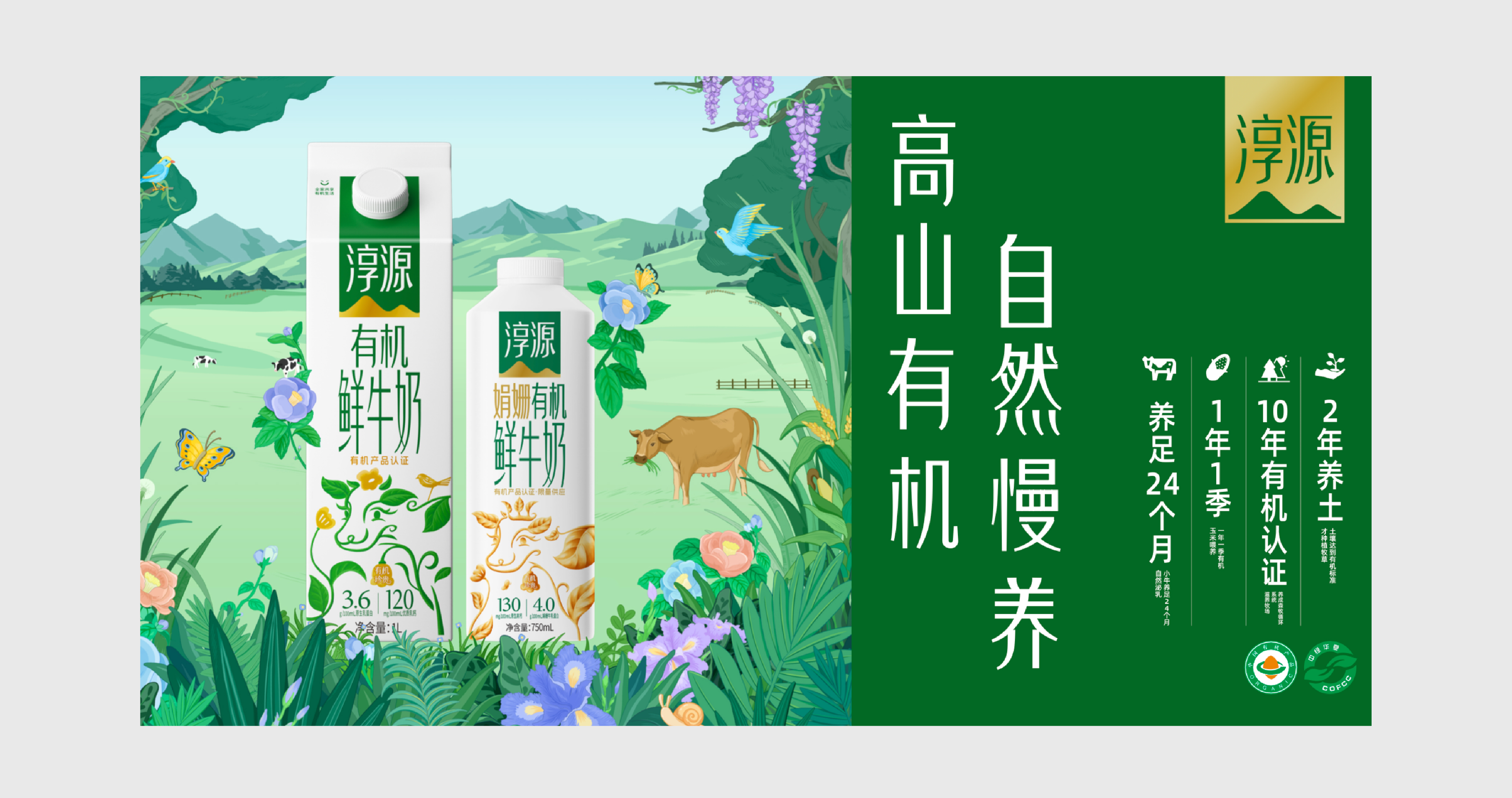
淳源有机鲜牛奶设计
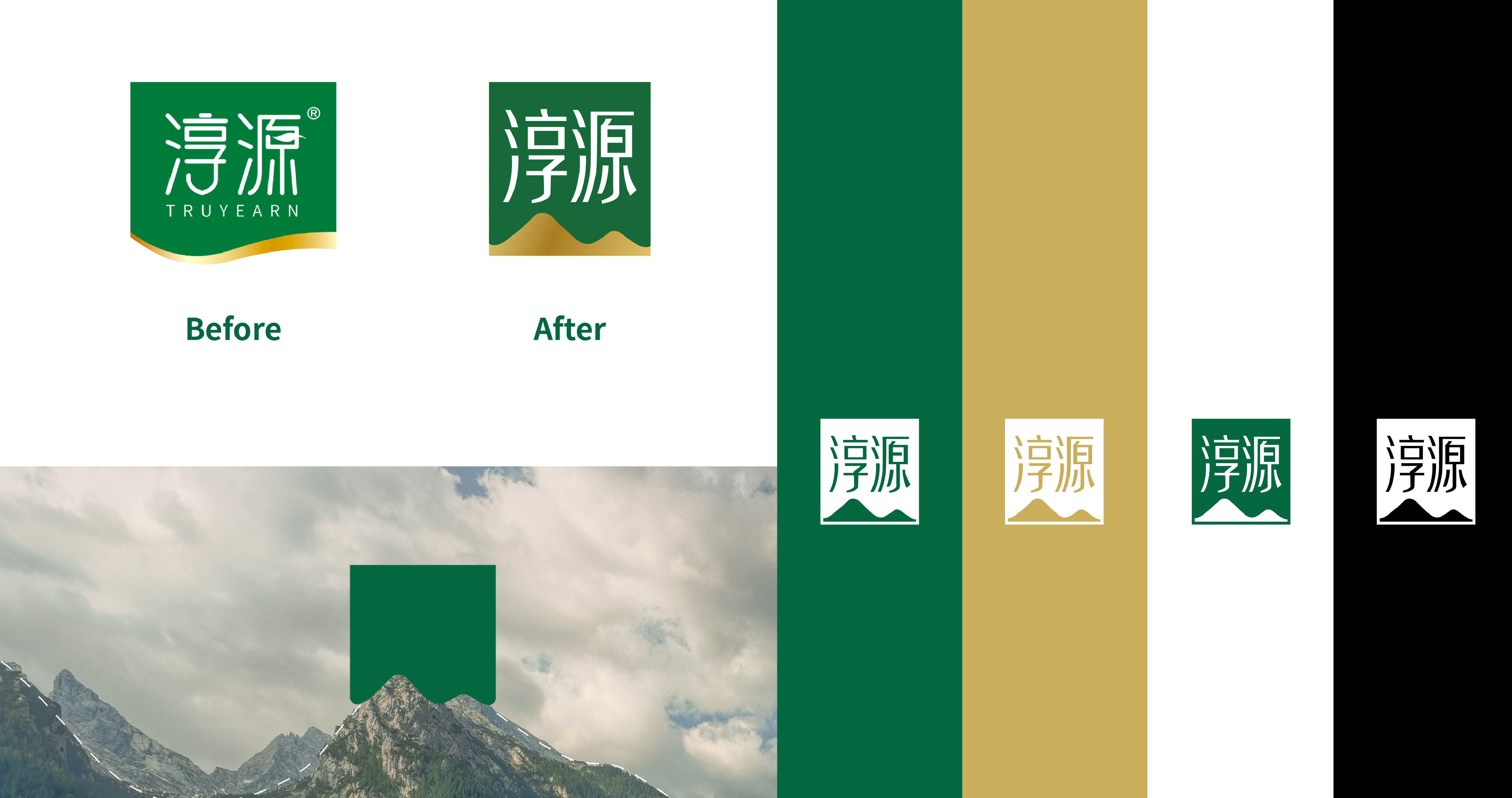
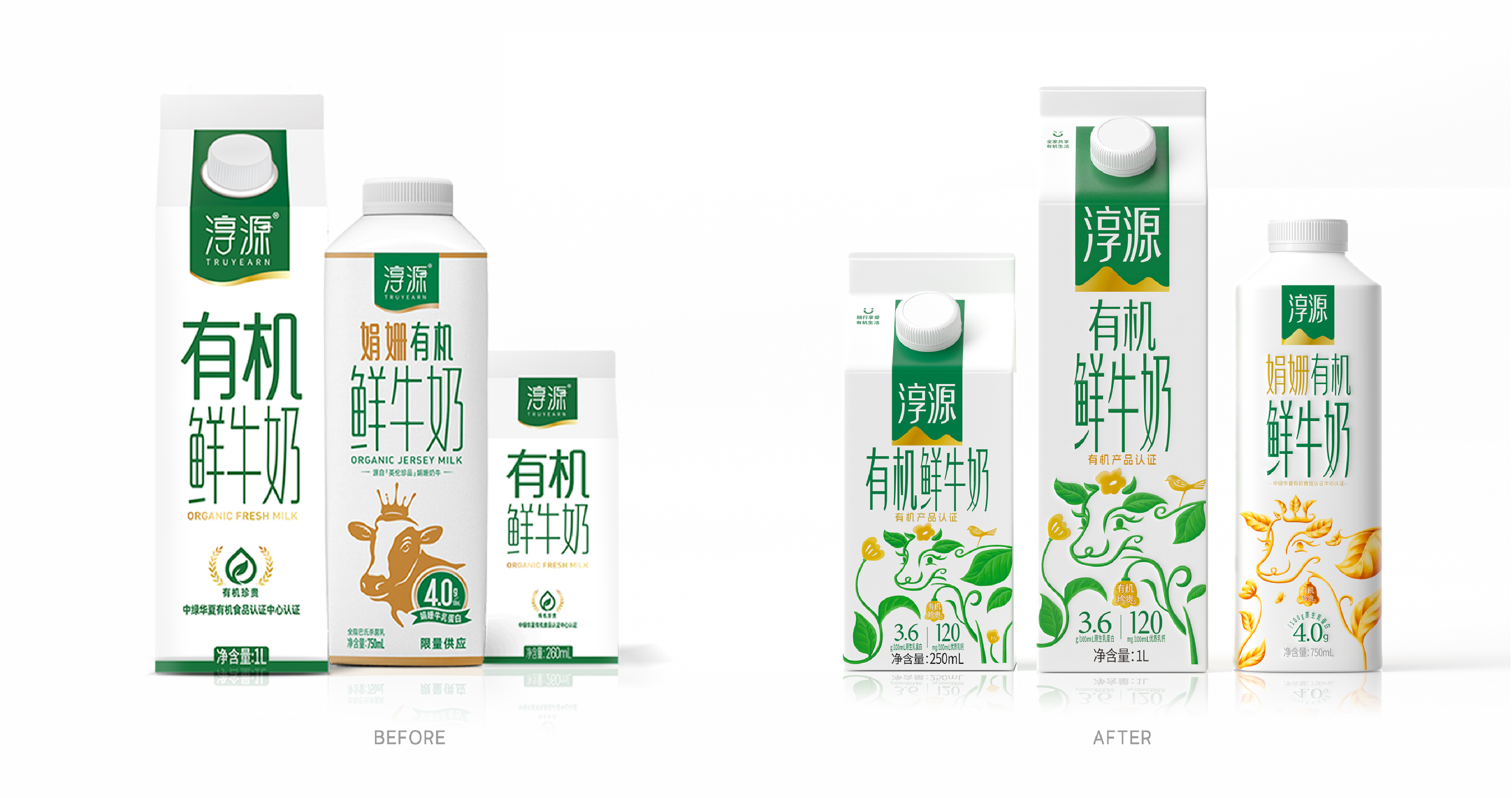
“淳源”是川渝地区高端畅销有机鲜奶品牌之一。上市多年其包装从未进行过更新,为顺应新市场的变化需求进行品牌与包装升级。
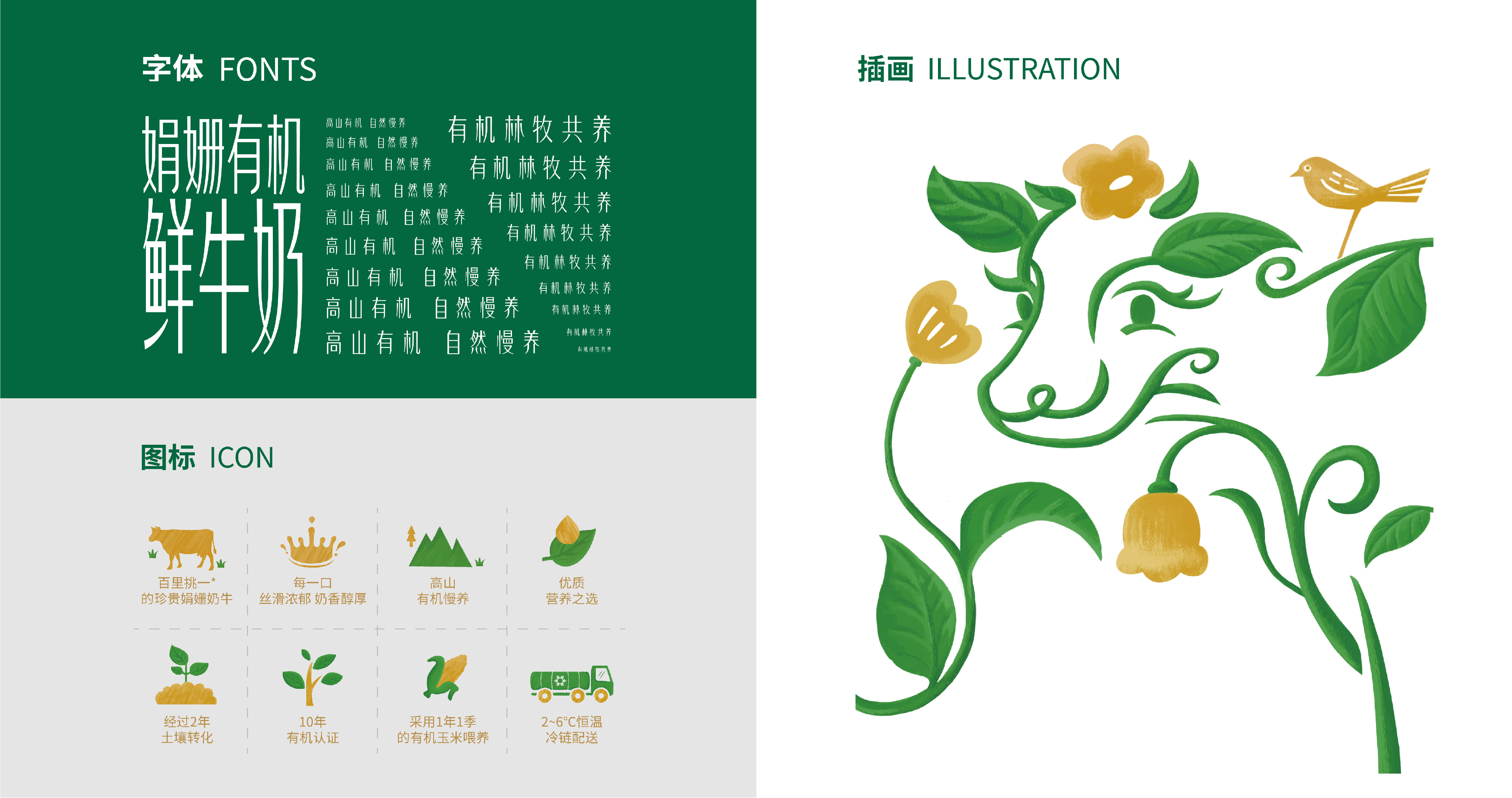
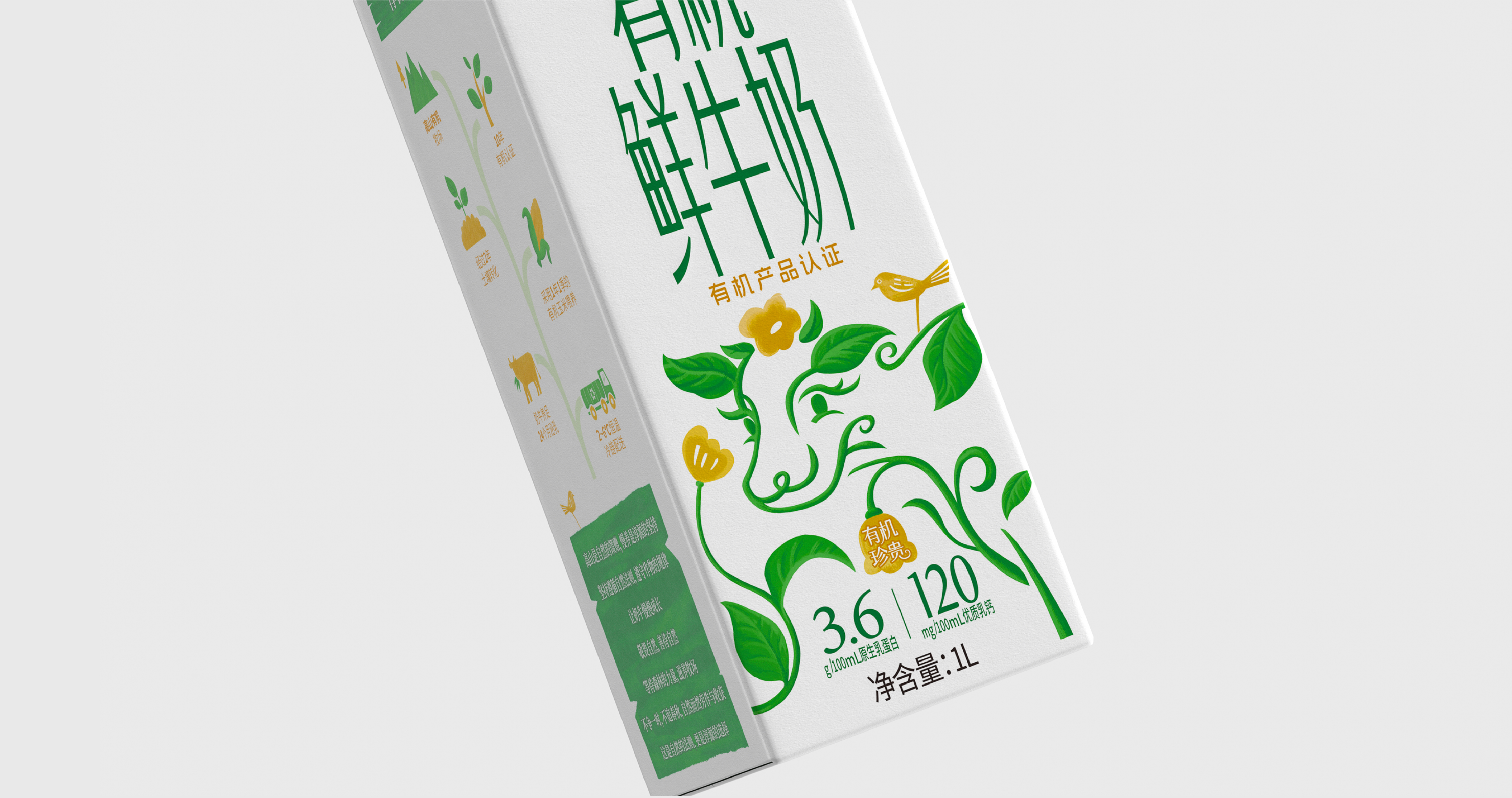
本次升级在保留品牌“白绿配色”与原有LOGO框的基础上,核心视觉元素“奶牛”被重新设计,更具生动性与表现力。我们采用自然生长的叶片
形态,勾勒出奶牛的轮廓—既强化了“有机”的核心属性,也传递出产品
“新鲜、雅致、醇香”的特质。这一独特设计为“淳源”构建了差异化的视觉识别体系。
Chunyuan is one of the top‑selling premium organic fresh milk brands in the Sichuan‑Chongqing region. Having been on the market for years, it has never undergone any packaging revamp. To adapt to evolving market demands, the brand is launching a brand identity and packaging upgrade.
For this upgrade, while retaining the brand’s signature white‑and‑green colour scheme and original logo frame, the core visual element — the cow — has been redesigned for greater vividness and expressiveness. We have adopted the form of naturally‑growing leaves to outline the cow’s silhouette. This not only reinforces the core attribute of “organic”, but also conveys the product’s qualities of “freshness, elegance and rich aroma”. This distinctive design establishes a differentiated visual identity system for Chunyuan.