简爱母品牌系列包装设计
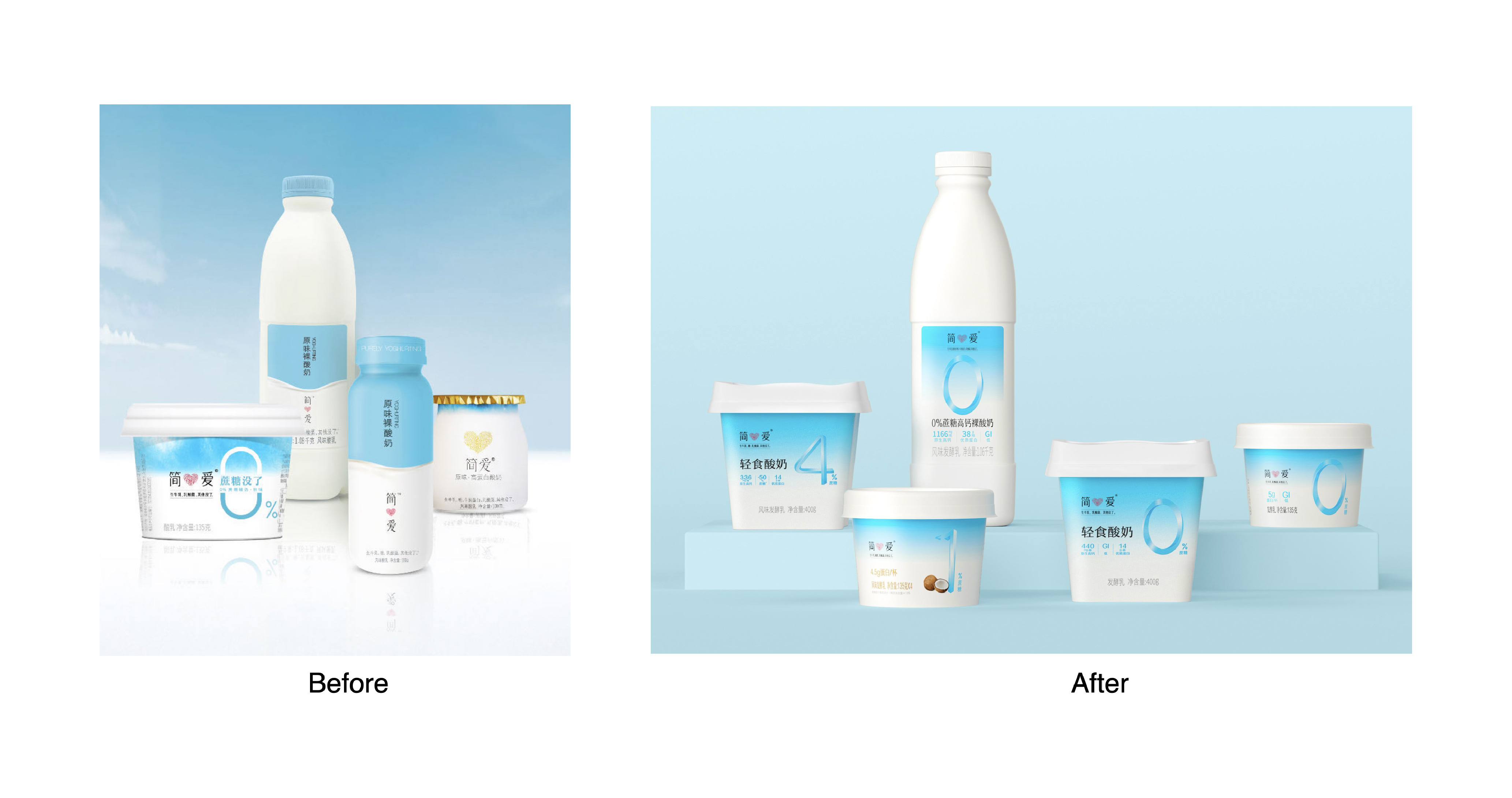
我们为简爱0糖135包装做了整体的优化升级
项目背景:135勺吃型酸奶作为简爱0糖系列代表产品,在品牌产品矩阵中具有重要地位0糖酸奶一直是小部分消费者的选择,如何获得增量市场是目前面临的问题
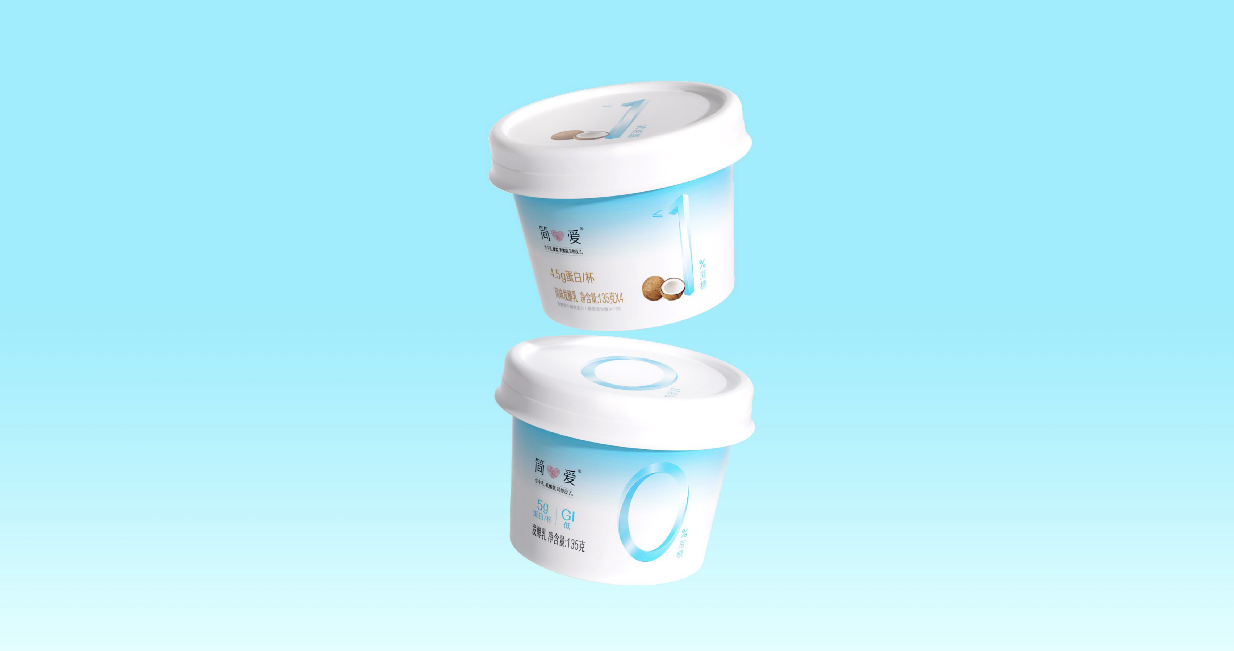
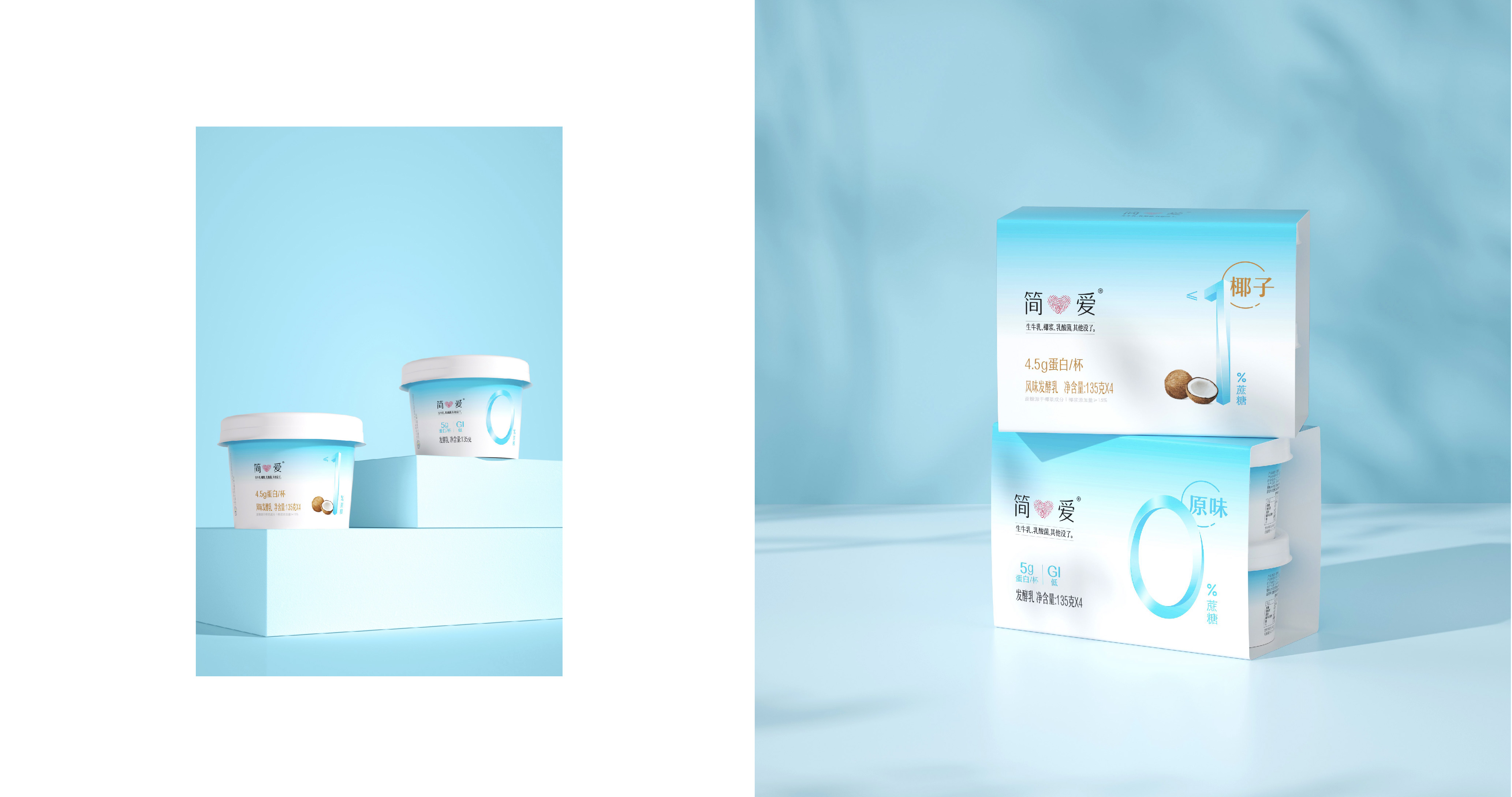
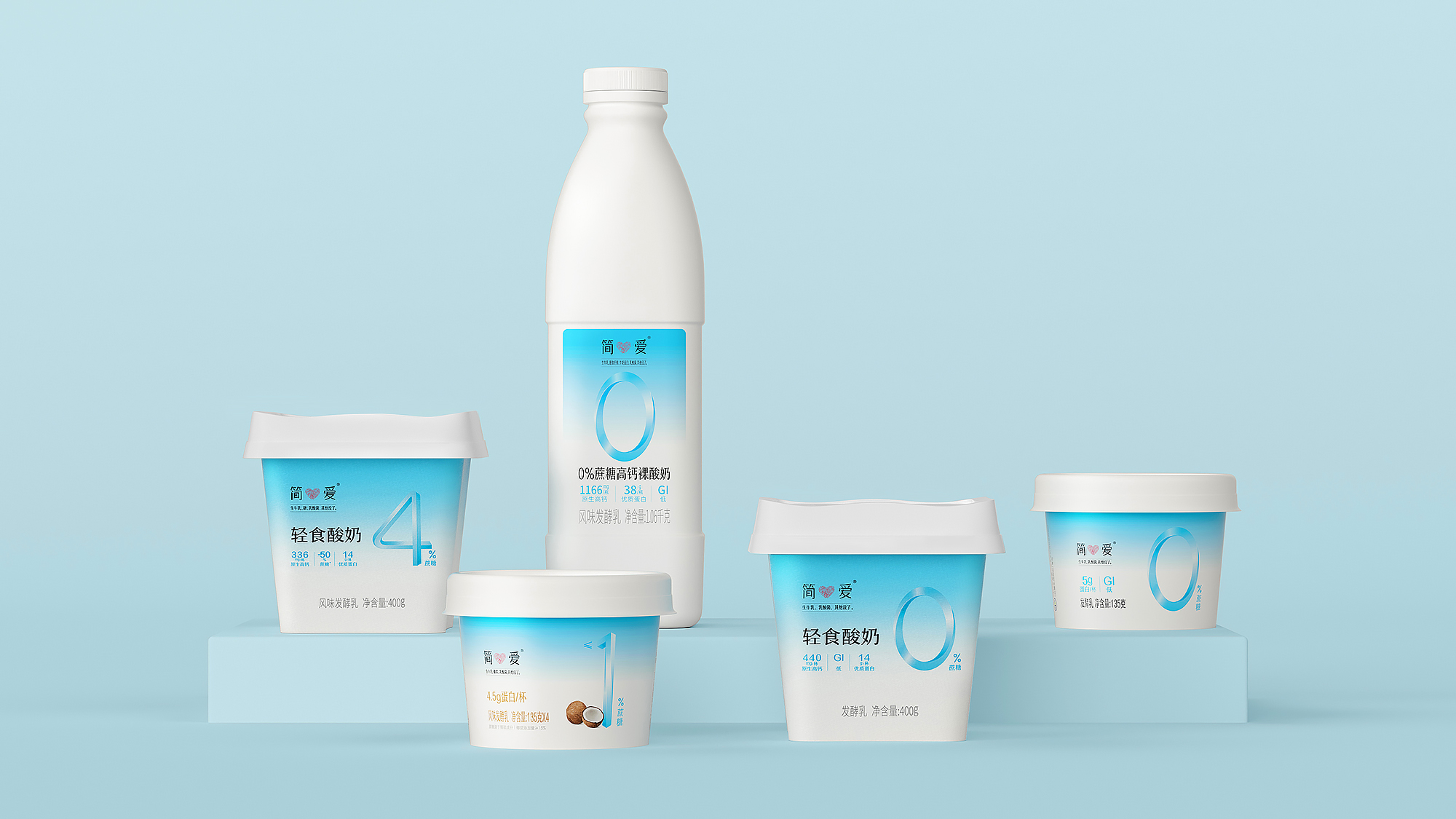
解决思路:强化酸奶控糖概念:强化0/1/4的核心价值点,让消费者第一眼就能看到含糖量优化原有的视觉资产:在保留消费者印象的同时进行优化,将其变细,更轻盈更易读建立视觉体系:通过蓝白品牌色的搭建,以及卖点的呈现,建立统一的视觉系统
We completed the overall optimization and upgrade for the packaging of Simplelove 0‑Sugar 135.
Project Background As a flagship product of Simplelove’s 0‑Sugar portfolio, the 135 spoon‑eaten yogurt occupies a key position within the brand’s product matrix. Zero‑sugar yogurt has long appealed only to a niche group of consumers, and tapping into incremental market growth has become a key challenge.
Solution Approach Reinforce the sugar‑control positioning of the yogurt: Highlight the core value proposition of 0/1/4, enabling consumers to spot the sugar‑content information at first glance. Refine existing visual assets: Optimize while retaining familiar brand recognition; slim down graphic elements for a lighter look and better readability. Establish a unified visual system: Build a consistent visual identity leveraging the brand’s blue‑and‑white colour palette alongside clear presentation of product selling points.